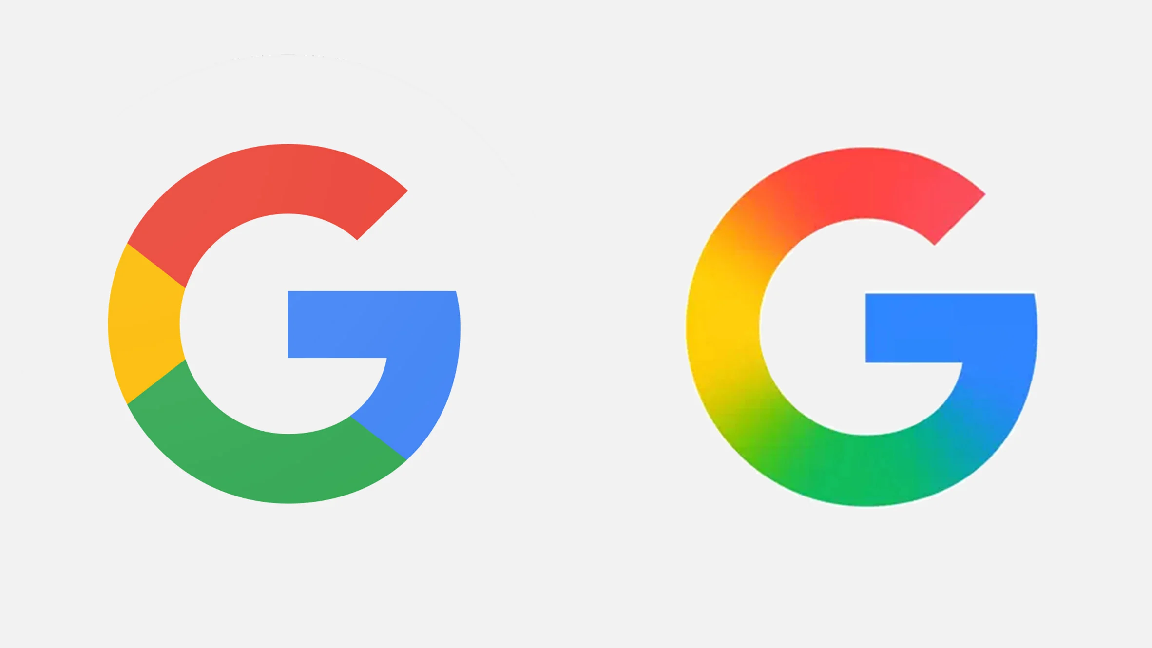
Google Unveils First Logo Redesign in a Decade, Embracing AI Era

For the first time in ten years, Google has updated its iconic “G” logo. This subtle yet significant change reflects the company’s deepening commitment to artificial intelligence (AI) and aligns with its evolving design language.
A Decade in the Making
Since its last major update in 2015, Google’s “G” logo has remained a constant presence across its platforms. The recent redesign introduces a gradient effect, blending the traditional red, yellow, green, and blue hues seamlessly. This shift from solid color segments to a fluid gradient mirrors the aesthetic of Google’s AI initiatives, particularly the Gemini project.
Reflecting the AI-Driven Future
The new logo isn’t just a visual update; it’s symbolic of Google’s strategic direction. The gradient design resonates with the branding of Gemini, Google’s advanced AI model, emphasizing the company’s focus on integrating AI across its services. This alignment suggests a cohesive visual identity as Google continues to innovate in the AI space.
Gradual Rollout Across Platforms
The redesigned “G” has begun appearing on the Google app for iOS and select Android devices, including Pixel phones. While the full rollout timeline remains unconfirmed, users can expect to see the updated logo across more platforms in the coming weeks.
Industry and User Reactions
The logo update has sparked discussions among design enthusiasts and the broader tech community. While some appreciate the modernized look, others view it as a subtle change. Nonetheless, the redesign signifies Google’s intent to stay current and visually represent its technological advancements.